I’ve never been much for making ornamental quilts, more interested in utilitarian and larger projects, but lately I’ve been focusing on smaller and more decorative creations.
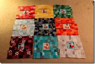
Before Christmas I started a scrappy rainbow quilt intended to be for a baby with foxes as the focal point. I was using different colors to frame each fussy cut fox, but plans for that quilt got sidelined when I didn’t like the way it was turning out. As I found out later when reading a magazine article about color, the value of the gray and light blue sections were outshined by the jewel tones of the other blocks. I didn’t realize exactly what the problem was at the time, but something about the quilt felt “off.”
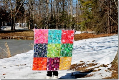
So I took out all the foxes, used them and the gray and blue sections to sew this pillow, made squares to fill in the gaps in the blocks, and chose two other intense colors to replace the lighter colors.
Score! The quilt turned out better than I imagined!
It may sound boring but stippling will ~always & forever~ be my favorite look for a quilt. Maybe because the modern quilt movement was just picking up steam as I was learning to sew, and stippling was on every quilt I admired, but there’s just something about that texture that appeals to me.
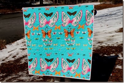
How cool is the back of this quilt? The fabric is an Alexander Henry print. Colorful and bold, a perfect match for the front.
The binding is also an Alexander Henry print called heath in a light violet color. My husband actually gave me lots of advice (some solicited, some not!) about the fabric choices in this quilt and helped me pick out the binding. He was right about the lighter colored binding; it really reins in the bold colors of the front and back.
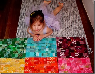
A big thanks to Bea for holding the quilt a million different ways for photos.
And thanks to Ronnie for helping me figure out a layout.
And a super-huge thanks to CeLynn for sending me the Sew Red glasses that helped me “see” the perfect layout. What a difference they made for those of us who are “color-challenged!”
Now it’s hanging in my sewing room as a bright and cheerful reminder that even if things don’t work out how you planned, you can still make something beautiful out of it.
Have a wonderful weekend! Linking up to Crazy Mom Quilts and Fort Worth Fabric Studio.


I love those scrappy blocks and what a gorgeous backing too!
ReplyDeletelove how you worked it all out. Beautiful quilt and a pillow too.
ReplyDeleteGo Bea and Ronnie! Too cute!
ReplyDeleteI love this quilt!!!! The foxes are in a better place;)
Sew Easy glasses?
absolutely love this quilt, and the backing is amazing :-)
ReplyDeleteThat's a beautiful one. I'd love to see how you use quilts throughout your home sometime on a blog post.
ReplyDeleteCute!!! What are these Sew Easy glasses you speak of??
ReplyDeleteGreat job! I love when the back of a quilt is as pretty as the front. ;)
ReplyDeleteI agree with Sara,the foxes are in a better place,that pillow is too cute. Isn't it great to have such wonderful helpers ;) The Jewel tones are simply beautiful,and the backing fabric is the perfect match! I love reversible quilts.
ReplyDeleteSo glad the glasses have helped you with the colors in your quilts. I like the stippling,sometimes a lot of fancy stitching just detracts from the quilt itself.
I really love this quilt! It's bold and modern yet scrappy and fun! It looks amazing hanging in sewing room! The big butterfly backing is fabulous too!!
ReplyDeleteThe quilt turned out so nice, perfect colors for your sewing room and I love your attitude.
ReplyDelete